 As our media in particular is a very small scale production an independent distribution company would be who we’d have to go to for distribution of our media product as big scale companies would be a lot less likely to do so. Soda Pictures are an example of a company that deal with independent films in particular, so this is more likely the kind of institution we’d work with to release our product and for a lot cheaper than a mainstream company such as Warner, on top of this it’s also a company based in the united kingdom so it’d mean it’s distributed to a local audience. As opposed to a company such as 20th Century Fox as they’re extremely well known and are guaranteed to be working with mass productions that will undoubtedly bring in a large number of views and revenue. As it is not professionally produced with a large crew managing each factor like sound and lighting, then it could easily be distributed through YouTube and become a partner to result in income per so many views this means it’ll be available for everyone to view for free and we’d still get a small amount of profit.
Friday 14 March 2014
What kind of media institution might distribute your media product and why?
As our media in particular is a very small scale production an independent distribution company would be who we’d have to go to for distribution of our media product as big scale companies would be a lot less likely to do so. Soda Pictures are an example of a company that deal with independent films in particular, so this is more likely the kind of institution we’d work with to release our product and for a lot cheaper than a mainstream company such as Warner, on top of this it’s also a company based in the united kingdom so it’d mean it’s distributed to a local audience. As opposed to a company such as 20th Century Fox as they’re extremely well known and are guaranteed to be working with mass productions that will undoubtedly bring in a large number of views and revenue. As it is not professionally produced with a large crew managing each factor like sound and lighting, then it could easily be distributed through YouTube and become a partner to result in income per so many views this means it’ll be available for everyone to view for free and we’d still get a small amount of profit.Tuesday 11 March 2014
In what ways does your media product use, develop or challenge forms and conventions of real media products?
There are many codes and conventions that stick out in thriller films; these can be in the form of characters, themes, thriller narratives, iconography and feelings the thriller can give off.
In terms of characters we have innocent citizens that get put in a dangerous situation; the narrative is generally similar to that in many thrillers in which the tension begins to arise when the protagonists are placed in a threatening situation where the chance of a lucky escape isn’t inevitable; we have suspenseful and potentially supernatural themes running through; the theme of suspense leads to creating the feeling of anticipation and uncertainty partnered with tension building music towards the end.
In summary the ones we included were:
- Suspenseful music
- Dim lighting
- Build of tension towards the ending
- Using tension & suspense to draw in audience
- Threat to protagonists

A particularly favourite part of mine within the opening sequence is a part right at the end of the clip, after the title animation, in which there is a large amount of uncertainty and tension is a swinging broken barn door; it successfully creates a really eerie and creepy atmosphere which is what we thought would look really good when we saw the clip for the very first time after it was filmed. The mixture of the clip and suspenseful music is what works together to build the right amount of tension and atmosphere; moreover from this it also creates the potential underlying supernatural theme that could be included further on in the film.
Ending clip of the barn door
)
Monday 10 March 2014
Who would be the audience for your media product?
For this evaluation question I format it into a very short RPG game, unfortunately it wouldn't upload to my blog so I have recorded myself running through it.
What have you learnt about technologies from the process of constructing this product?
Better to read in full screen
Thursday 6 March 2014
Monday 3 March 2014
Friday 28 February 2014
Editing Process
Clips
For the editing of the footage and sound clips we used Adobe Premier Pro and Adobe Soundbooth, both in CS4. Before importing our clips into Premier Pro we went through and deleted ones that had errors or were accidental recordings and kept the ones that had potential, after that we renamed most of them to make finding the right clips simple and non time consuming. After this we began to chose our favourite clips and import them in the correct order and trimmed parts we didn't need, this also helped to create continuity throughout the opening. This was mine, Heather's and Beth's first time using Premier Pro properly and it was confusing to begin with but we began to get the hang of it and build our skills throughout the process, which took in total just over a week. Heather took a lot of charge in doing extra trimming to clips and sorting transitions which was fine with us because we all still got our input and gave our opinions on changes being made.
Sound/Music
 During filming the weather was extremely windy and it effected our audio tremendously so we thought about ways we could resolve the audio problem and we decided to take out every piece of audio throughout the whole composition and dub over the speech and find various sound effects to make up for the ambient sounds such as footsteps, birds and wind. I took a lot of charge when it came to the sound, in terms of equalizing the volumes, placing the clips and trimming appropriately. We found a website that we got all our sound stock from which was all of a high quality, it took some time going through all the samples but we ended up with some really good and raw sounds that we could mix and combine to create a natural ambient sound-scape. We asked other media students (Jacob Maud, Esha Bhogal and Heather Pullen) to read out the script so we could use their voices to dub over the original voices as they were extremely muffled. Editing the voices into the composition was tricky in terms of matching the lips to the words but I managed to get it to look reasonably accurate apart from one which was extremely hard to do. The footsteps had to be matched to the steps which was incredibly hard to do and very time consuming but I was determined for it to look real so I spent time correctly arranging the footstep sound clips appropriately. After the sound was correctly placed and trimmed I did a little research into how to correctly edit the clips to make them louder, quieter and how to have an equal level of volume in a number of clips and this is where I got to use Adobe Soundbooth. I used a few tutorials and quickly got the hang of it and corrected our audio so we could move onto adding finishing touches and music.
For the editing of the footage and sound clips we used Adobe Premier Pro and Adobe Soundbooth, both in CS4. Before importing our clips into Premier Pro we went through and deleted ones that had errors or were accidental recordings and kept the ones that had potential, after that we renamed most of them to make finding the right clips simple and non time consuming. After this we began to chose our favourite clips and import them in the correct order and trimmed parts we didn't need, this also helped to create continuity throughout the opening. This was mine, Heather's and Beth's first time using Premier Pro properly and it was confusing to begin with but we began to get the hang of it and build our skills throughout the process, which took in total just over a week. Heather took a lot of charge in doing extra trimming to clips and sorting transitions which was fine with us because we all still got our input and gave our opinions on changes being made.
Sound/Music
During filming the weather was extremely windy and it effected our audio tremendously so we thought about ways we could resolve the audio problem and we decided to take out every piece of audio throughout the whole composition and dub over the speech and find various sound effects to make up for the ambient sounds such as footsteps, birds and wind. I took a lot of charge when it came to the sound, in terms of equalizing the volumes, placing the clips and trimming appropriately. We found a website that we got all our sound stock from which was all of a high quality, it took some time going through all the samples but we ended up with some really good and raw sounds that we could mix and combine to create a natural ambient sound-scape. We asked other media students (Jacob Maud, Esha Bhogal and Heather Pullen) to read out the script so we could use their voices to dub over the original voices as they were extremely muffled. Editing the voices into the composition was tricky in terms of matching the lips to the words but I managed to get it to look reasonably accurate apart from one which was extremely hard to do. The footsteps had to be matched to the steps which was incredibly hard to do and very time consuming but I was determined for it to look real so I spent time correctly arranging the footstep sound clips appropriately. After the sound was correctly placed and trimmed I did a little research into how to correctly edit the clips to make them louder, quieter and how to have an equal level of volume in a number of clips and this is where I got to use Adobe Soundbooth. I used a few tutorials and quickly got the hang of it and corrected our audio so we could move onto adding finishing touches and music.
Thursday 20 February 2014
Filming
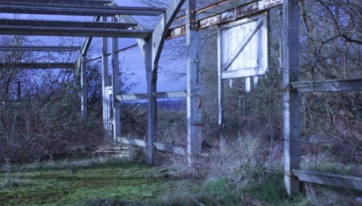 As we have media lessons on a Monday and Tuesday we took this opportunity to go off campus and get some filming done; on Monday morning we spend the first two hours doing scenic shots and focused mainly on them as the actors weren't available to film as they had lessons, we got a lot of good shots of various features in the abandoned area. We shot more than we needed but we wanted to have a safe amount of footage as we wanted to focus solely on the actors the next day. On the Tuesday unfortunately I was ill and unable to film but Beth and Heather went ahead as planned and filmed the shots with the actors as they were all available on the Tuesday afternoon. As a whole, after we tested and deleted clips, we have 32 clips of footage so we have more than plenty to work with and so hopefully we won't have to go back and film anything extra, which was our intention when filming so we have a good amount of footage. The photo included is a screenshot of one of the scenic shots that I like the most, when trimmed, and I mentioned the feature of the hanging barn door in one of my previous posts, we managed to capture it in the wind like when we saw it the first time and hopefully there will be a place for it in the opening sequence once we begin the editing process.
As for equipment, we took with us a tripod, a sound recorder and a camera; no lighting was needed as we had plenty of natural light and there was also no outlet near by anyway which isn't very practical but it didn't effect our production and aims.
Tuesday 18 February 2014
Planning: Risk Assessment
Risk
|
Severity #/10
|
Avoiding Risk
|
During
the first visit to the location I actually grazed my leg on a concrete
bearing whilst trying to climb through a gap so this is the first risk I thought
of.
|
4-6/10
|
To avoid this we, and the actors,
can simply be more careful in where we’re walking and avoid anything that
could potentially harm us
|
Tripping
on twigs/branches, there’s a large amount of twigs and branches lying around
on the location and depending on how hard you trip/fall it could be a massive
risk.
|
2-7/10
|
We have to be very careful in general when moving around
the location because it’s very likely that we’ll end up running into this
problem so watching our step will be the thing to do in order to avoid this.
|
Banging
heads or equipment, such as camera fixed on tripod, on the metal framing
around the abandoned building. This could result in a concussion for us or
the actors and hundreds of pounds worth of damage to school equipment.
|
6-10/10
|
Pre-warn the actors about the bars
and ask them to be careful when entering. As for the equipment we as a group
have to be extremely careful and watch every step to ensure that we don’t
deal any damage to the equipment.
|
Collapsing
of the building is a massively high risk although very unlikely.
|
10/10
|
We checked around the location prior to choosing it to
ensure that it was a safe place to shoot and there wouldn’t be any risks to
us, the equipment or the actors.
|
Due to
the weather conditions there is an excessive amount of mud around the area we
have to travel through to get to our filming location, although this is a particularly
low risk we still need to consider its avoidance.
|
4/10
|
Dressing appropriately for the
weather would be the initial path to take, so wearing boots or shoes with a
good grip.
|
Monday 17 February 2014
Planning: Actors, Costume & Props
Actors
We have decided on three actors for our opening, two females and one male. These were based on preferences we'd set and we managed to roughly meet these.
 James Cox is one of the first people we'd picked as he was available and he also fitted the character profile we'd thought up. A young version of Mark Ruffalo is roughly the character we were looking for as this actor in particular is featured in a lot of thriller films and he has a good look, we wanted a younger representation of him because the plot is based on a group of teenagers. James is one of the only people we came across that looked fairly similar to this actor and he also proved to be a considerably good actor; he will be the second 'victim' in our thriller.
Secondly is one of the females we chose, Hannah Woodward, who fit the preference of being slightly tall and blonde, we didn't chose a specific actor/actress for her to be based on because we wanted this character to be slightly more original. Hannah is chosen to be the first 'victim' in our thriller when exploring.
Georgia Gray is the last person we chose as she was perfect for the role of a short girl, again we didn't base her on a celebrity actor profile because it wasn't necessary. Georgia is left to be the last one standing in the opening sequence, she's perfect for this as she's very petite and fragile looking so she'll appear as a being extremely vulnerable and unguarded when she doesn't have her friends around her as protection.
Costume & Props
For the costume there isn't anything in particular we want the actors to wear as we just want it to appear as a standard day when they stumble upon the abandoned building so we've requested that they all wear their own clothes that they would on a normal day, we want to keep the attire completely casual.
As for props we actually don't need to take anything with us we can use the features of the location to build character, one thing in particular that we liked a lot is a half broken barn door that, when we visited during location scouting, was swinging in the wind which looked amazing and brought a real eerie atmosphere, so we'd really like to include this in some part of the thriller. In addition to this there was a set of decomposing swinging doors that had graffiti on that we're going to have as the first thing the group notice when they get into the abandoned area.
We have decided on three actors for our opening, two females and one male. These were based on preferences we'd set and we managed to roughly meet these.
James Cox is one of the first people we'd picked as he was available and he also fitted the character profile we'd thought up. A young version of Mark Ruffalo is roughly the character we were looking for as this actor in particular is featured in a lot of thriller films and he has a good look, we wanted a younger representation of him because the plot is based on a group of teenagers. James is one of the only people we came across that looked fairly similar to this actor and he also proved to be a considerably good actor; he will be the second 'victim' in our thriller.Secondly is one of the females we chose, Hannah Woodward, who fit the preference of being slightly tall and blonde, we didn't chose a specific actor/actress for her to be based on because we wanted this character to be slightly more original. Hannah is chosen to be the first 'victim' in our thriller when exploring.
Georgia Gray is the last person we chose as she was perfect for the role of a short girl, again we didn't base her on a celebrity actor profile because it wasn't necessary. Georgia is left to be the last one standing in the opening sequence, she's perfect for this as she's very petite and fragile looking so she'll appear as a being extremely vulnerable and unguarded when she doesn't have her friends around her as protection.
Costume & Props
For the costume there isn't anything in particular we want the actors to wear as we just want it to appear as a standard day when they stumble upon the abandoned building so we've requested that they all wear their own clothes that they would on a normal day, we want to keep the attire completely casual.
As for props we actually don't need to take anything with us we can use the features of the location to build character, one thing in particular that we liked a lot is a half broken barn door that, when we visited during location scouting, was swinging in the wind which looked amazing and brought a real eerie atmosphere, so we'd really like to include this in some part of the thriller. In addition to this there was a set of decomposing swinging doors that had graffiti on that we're going to have as the first thing the group notice when they get into the abandoned area.
Tuesday 11 February 2014
Planning: Producing a Title
As previously stated, we have decided on Abandoned as being our title due to its high potential and relevance to our plot. But, we need to focus on the style of the title and how it'll be introduced to the movie. Within the style we need to address→ the colour of the text, the background the text is on whether it be a block colour or a picture, the font or range of fonts, whether or not to include some type of credit with the title, animation (if any) and how we can use any of these features to link back to the film.
Font
Font is one of the first features we need to choose because that's that base to our title.

The font shown above is 'Orator Std' I personally like this one because it's very minimalistic and there isn't much to it but at the same time, due to the spaced letters, it's very bold and has a very strong aspect to it.

The font shown above is 'Viner Hand ICT' and this is my least favourite of our chosen fonts as it brings too much horror character into the picture and we don't want the film to be mistaken as a horror at first glance.

The font shown above is 'Trajan Pro' and this is my favourite font that we've come across so far because, similarly to Orator Std, it's minimalistic and I think this brings a good professional atmosphere into the title as we don't want it to be too overpowering, keeping it simple but effective is the most professional approach.

The font shown above is 'Modern No.20' I do like this font a lot because it's very stylish and sleek but it doesn't properly fit the mood of our film and thriller genre, it gives off more of a film noir feel.
As a group we've decided on Trajan Pro because it has the most potential and it's one we all decided feels and looks best personally so there wasn't much debate when it came to choosing a fitting font.
Colour Scheme
We're going to stick to two standard colours which are a background colour and a font colour, we decided we just want to keep the title itself plain and separate to the moving picture. These are the colour schemes, following the font we chose, that have potential.

We have chosen to invert each of the colour schemes so that we can see which way round looks better.
Firstly is black and white, this is readily the favourite because it looks sleek and brings in a dark mood, as opposed to pastel or bright colours.

Blue and white is the next scheme we decided on, we shied away from a bright blue and chose a more dull greyed out blue so keep the 'dark mood' consistent throughout the schemes.

Thirdly we have deep red and white and one thing I particularly like about the deep red is that it's a good representation or foreshadow of blood so this could be anything from injury to murder but it's already hinted to happening within the title, and this is something we're aiming to do in order to
create a good strong title.

Another colour scheme that we chose way dark grey and grey, this allows us to stray away from including white in each of the colour schemes and still looks extremely appealing. One thing I particularly like about this colour scheme is that, luckily, it doesn't clash like using two different colours would, such as yellow and red.

Lastly we have another red and white except this is using an evidently more vibrant red. This is my least favourite because I simply think the highly saturated red is far too overpowering and doesn't fit the concept of a thriller and especially doesn't provide a dark mood.
From the colour schemes we decided on the black and white one with black and the background and white for the font colour as this one worked best for us.
Animation
 Coming round to the animation stage this allowed me to
working on Adobe After Effects, which was hard to begin with but I got the hang of it and this allowed me to build my skills and apply different animation effects to the title. We're using animation to give the title the most amount of character.
I came across an effect that allows the letters to disappear one by one and this links not only to the plot of the film but to the title name 'Abandoned'. I happily took charge in the animation process of the title which gave me a little independence on the project.
We also decided to credit our names as the directors underneath the title animation.
Font
Font is one of the first features we need to choose because that's that base to our title.
The font shown above is 'Orator Std' I personally like this one because it's very minimalistic and there isn't much to it but at the same time, due to the spaced letters, it's very bold and has a very strong aspect to it.
The font shown above is 'Viner Hand ICT' and this is my least favourite of our chosen fonts as it brings too much horror character into the picture and we don't want the film to be mistaken as a horror at first glance.
The font shown above is 'Trajan Pro' and this is my favourite font that we've come across so far because, similarly to Orator Std, it's minimalistic and I think this brings a good professional atmosphere into the title as we don't want it to be too overpowering, keeping it simple but effective is the most professional approach.
The font shown above is 'Modern No.20' I do like this font a lot because it's very stylish and sleek but it doesn't properly fit the mood of our film and thriller genre, it gives off more of a film noir feel.
As a group we've decided on Trajan Pro because it has the most potential and it's one we all decided feels and looks best personally so there wasn't much debate when it came to choosing a fitting font.
Colour Scheme
We're going to stick to two standard colours which are a background colour and a font colour, we decided we just want to keep the title itself plain and separate to the moving picture. These are the colour schemes, following the font we chose, that have potential.
We have chosen to invert each of the colour schemes so that we can see which way round looks better.
Firstly is black and white, this is readily the favourite because it looks sleek and brings in a dark mood, as opposed to pastel or bright colours.
Blue and white is the next scheme we decided on, we shied away from a bright blue and chose a more dull greyed out blue so keep the 'dark mood' consistent throughout the schemes.
Thirdly we have deep red and white and one thing I particularly like about the deep red is that it's a good representation or foreshadow of blood so this could be anything from injury to murder but it's already hinted to happening within the title, and this is something we're aiming to do in order to
create a good strong title.
Another colour scheme that we chose way dark grey and grey, this allows us to stray away from including white in each of the colour schemes and still looks extremely appealing. One thing I particularly like about this colour scheme is that, luckily, it doesn't clash like using two different colours would, such as yellow and red.
Lastly we have another red and white except this is using an evidently more vibrant red. This is my least favourite because I simply think the highly saturated red is far too overpowering and doesn't fit the concept of a thriller and especially doesn't provide a dark mood.
From the colour schemes we decided on the black and white one with black and the background and white for the font colour as this one worked best for us.
Animation
working on Adobe After Effects, which was hard to begin with but I got the hang of it and this allowed me to build my skills and apply different animation effects to the title. We're using animation to give the title the most amount of character.
I came across an effect that allows the letters to disappear one by one and this links not only to the plot of the film but to the title name 'Abandoned'. I happily took charge in the animation process of the title which gave me a little independence on the project.
We also decided to credit our names as the directors underneath the title animation.
Subscribe to:
Posts (Atom)